Wood offers an extensive range of shades and undertones, providing limitless possibilities for your color choices. While certain colors may complement specific types of wood better (we’ll explore that later), there’s always a wood variety that will perfectly match your desired color scheme. With so many options, how do you determine which color is the ideal fit for your project?
Notice how each one makes you feel different? The mood of the room shifts depending on the colours used in the space; Most likely, you found that the yellow room was much more positive and uplifting, the green room the most calming and rejuvenating, and the orange/pink room the most charged and energetic.
This results from colour psychology: The study of how different colours impact our moods and behaviours. When deciding what colors to use in certain parts of your home, consider the following:
Green
Green is fresh and energizing. It makes people feel safe and adds a natural element to any room. Lighter shades boost focus, while darker shades are often more elegant. When in doubt, green is a versatile colour ideal for any room in your home.
Purple
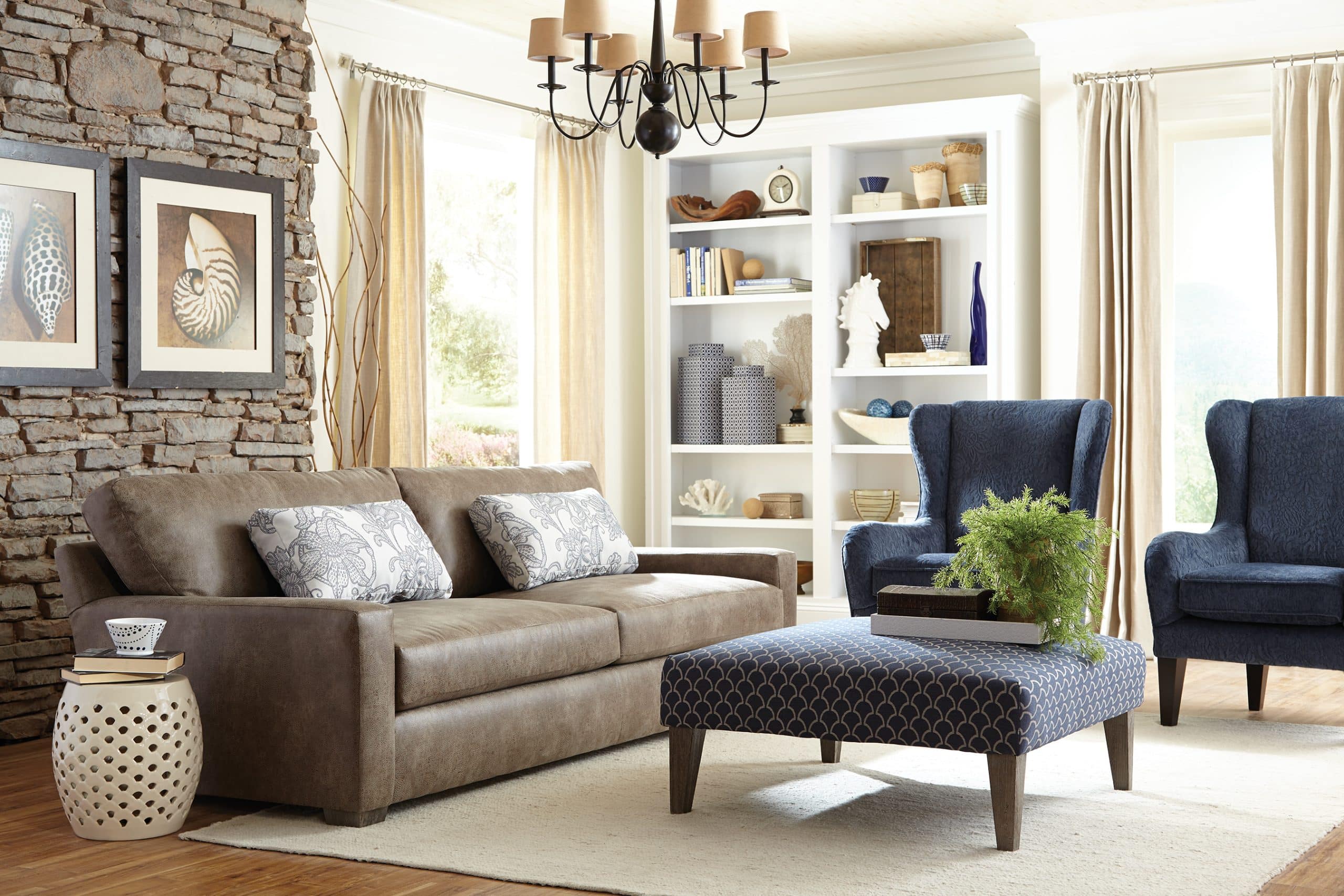
Purple can be a warm colour, suited for living rooms or other shared spaces, or toned down to a cool grey or pastel colour, ideal for bedrooms. Purple is a calming yet lively colour, but it is also a more unconventional choice, making a statement and adding interest where it is used.
Orange
Orange is energizing, creative and results in increased socialization. It is suggested for home gyms or dining rooms/kitchens. To stay away from being too bright, consider using softer shades or using it for accents and smaller areas rather than an entire wall.
Red
Red is often known to raise energy levels and lead to increased excitement and ambition. Darker shades can add an elegant touch to the main areas of your home, but it is not recommended for bedrooms or other areas where you intend to relax.
Yellow
Yellow is a happy, optimistic colour. It instantly lifts a room and emulates the warmth of sunlight. Primary, yellow can be overpowering, so use a lighter colour, smaller amounts, or a less bright colour, such as a golden or mustard shade. Yellow is an excellent colour for a living room or front entranceway-any area that you want to appear bright and welcoming.
Blue
Blue is one of the easiest colours to use. Like green, its calming effect makes it ideal for anywhere in your home. It is known to promote calm feelings and intelligence. Consider putting this in your bedroom or study spaces to utilize its full benefits.
Pink
Pink is known for its love and softness and is often seen as a more feminine colour. That being said, slightly pink tones can subtly brighten a room. Darker shades of pink are often used much more intentionally in brightly-coloured homes or rooms where you want to make a statement.
Neutrals
Neutrals, also called non-colours, are great to pair with colours. They can add to a room without taking away the focus on other colours. White is one of the most versatile neutrals and is quite popular in minimalist houses. It connotes cleanliness and keeps a room light and bright.
On the other hand, black is often seen as conveying power, mystery, depth, and drama. It is a sleek and classic colour, and pairs well with lighter accent colours. Because of its simple nature, its popularity is not prone to change because of trends.
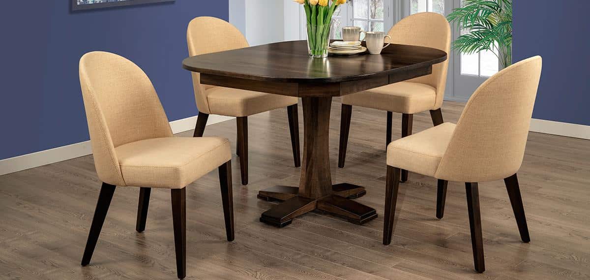
Browns are one of the most accessible neutrals to add to a home-be it through painted walls, accents, or solid wood furniture. Neutral and beige colours can pair well with solid wood and are comforting and reliable. They can also add a sense of maturity to space when used correctly.
Matching Solid Wood and Colours
When combining solid wood and colours, there are a few things to keep in mind. Lighter colours pair well with darker finishes on solid wood furniture. Darker shades add depth and intensity and must be paired with lighter-coloured furniture to balance them out. To create a more subdued appearance, combine similar shades, such as using a darkly-finished bookshelf against a deep red wall.
Identifying the colours in the wood and stain is essential when considering which finish to use. If your wood and finish have warm undertones, jump to the other side of the colour wheel to find complementary cool colours for paint and other primary colours in the room. If your furniture has cool undertones, check out warm colours for inspiration in other decorations.
Remember to use opposite colours as much as possible to keep a room looking balanced. For help designing custom solid wood furniture that matches your dream home, contact us or visit us today in-store!